💡 Important update: introducing "Layout Builder"
Showell has introduced a brand-new theming experience called "Layout Builder", replacing the previous Template Editor (BrandBuilder).
This article focuses entirely on the new Showell Layout Builder, explaining how the new system works and how you can use it moving forward.
➡️ Note that the old editor is not being updated anymore. While it is still fully supported for existing setups, it is planned to be sunset in the future.
Who is this for?
👤 Administrators
👁️🗨️ Available in selected plans
In this article
Before you start: Enabling Layout Builder & preparing your setup
Create your own Layout template(s)
Apply a Layout template to a Main Page or folder
Navigation panel: Blocks and Outline
What is Layout Builder?
Layout Builder let you fully customize the look and structure of your main page and folders. Using the new Layout Builder, you can design flexible layouts that match your brand and adapt to different use cases - without sacrificing speed or simplicity.
Easily combine logos, images, videos, text, and interactive elements into structured layouts made up of sections and components that work beautifully on both desktop and mobile. Create layout templates once, reuse them across folders, or fine-tune the experience per folder to highlight exactly what matters to your audience.
.png?width=670&height=467&name=image%20(4).png)
Layout Builder allow you to go beyond simple navigation and create page-like experiences focused on clarity and engagement, such as:
- Branded landing pages for specific audiences, regions, or use cases
-
Hero sections that introduce a folder or guide users toward key content
-
Story-driven layouts that explain a product, solution, or campaign step by step
-
Curated content overviews highlighting new, recommended, or frequently used files
➡️ Read more about Layout Builder
Before you start: Enabling Layout Builder & preparing your setup
Before working with the Layout Builder, there are a few things to set up.
Enable the Layout Builder
To avoid confusion with the legacy editor, the new Layout Builder is not enabled by default. Once you’re ready to start using it, you’ll need to enable it manually:
-
Open the Showell App for Web
-
Click Admin in the side menu > General Preferences
-
Scroll down to 'Experimental' and activate 'Enable Layout builder'.
Prepare your branding resources
While not a requirement, we recommend uploading all branded materials to your Application Resources in advance. This gives you quick access to everything you may want to use while building layouts, such as:
-
Wallpapers (images and videos)
-
Logos
-
Thumbnails
-
Custom fonts (your company fonts)
Having these assets ready allows you to focus on designing layouts without interruptions.
In addition, make sure your branding settings are configured in Showell. This includes your logo and, most importantly, your brand colors. All colors added in your branding settings automatically become available in the Layout Builder, making it easy to apply consistent styling across themes and folders.
For more details on setting up branding, see the Branding article.
Understand Layout templates
Showell provides a set of built-in layout templates that you can use freely across your main page and folders. These are ideal if you want a consistent look and feel without starting from scratch each time.
These layout templates define both the visual style and page structure, giving you a ready-made starting point for building experiences.
Beyond that, you can also create your own custom layout templates. These act as easy-access starting points that reflect your preferred layout, structure, and branding, and can be reused whenever you apply a layout to a folder.
Create your own Layout template(s)
In addition to the built-in layout templates, you can create your own custom templates to reuse across your Main Page and folders. These templates allow you to define the structure, flow, and key sections of a page.
You can create layout templates the following way:
-
Open the Showell App for Web
-
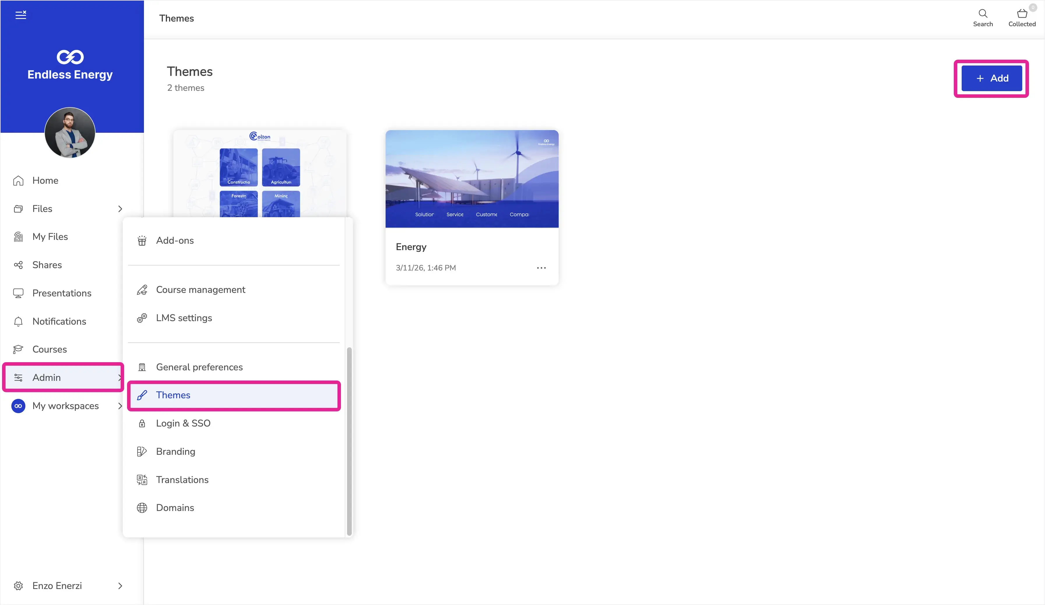
Click Admin in the side menu > Themes
-
Click "+ Add" in the top-right corner.
- You'll be able to add a Title for your template
- You can either select one of the existing templates or leave all options unselected to build a layout from scratch.
This opens the Layout Builder, where you design the structure and layout of your template by combining sections and elements into a complete, page-like experience.
-
For a deeper dive into all available elements and editing options, see the Layout Builder overview section in this article.
While you’re free to design templates in any way you like, we recommend keeping templates generic and flexible. For example, use placeholders for links or buttons that will later point to folder-specific content. This way, when applying a template to a folder, you can quickly adapt it without rebuilding the layout each time.
Apply a Layout template to the Home Page or folder
Once your...
-
Pre-made layout templates are ready,
-
or if you prefer to use one of Showell’s built-in templates,
-
or start from scratch,
... you can apply a Layout to your Home Page or any folder. Unlike pre-made templates (created in the Themes section), layouts applied here become visible to users once saved.
To apply a Layout:
-
Open the Showell App for Web.
-
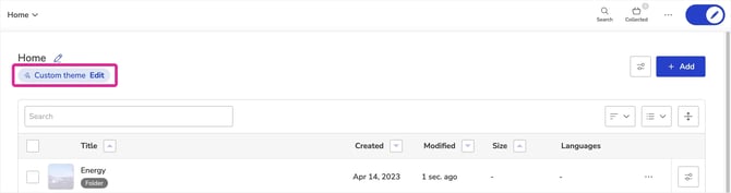
Navigate to your Home Page or the folder you want to update.
-
Go to Edit mode.
-
Under the page title, You'll find "Custom Theme" > click "Change/Edit".
You can now:
-
Select one of your own Layout templates.
-
Choose a built-in Showell template.
-
Click Start from scratch to build a new Layout.
After selecting your option, the Layout Builder opens, allowing you to customize the structure and content of the page.
-
For a detailed overview of available sections, elements, and editing options, see the Layout Builder overview section in this article.
Layout Builder
Layout Builder is where you fine-tune how your Layout or template looks and behaves. This is where you design the structure of your Home Page or folders, arrange content visually, and control styling and layout settings – all in one place.
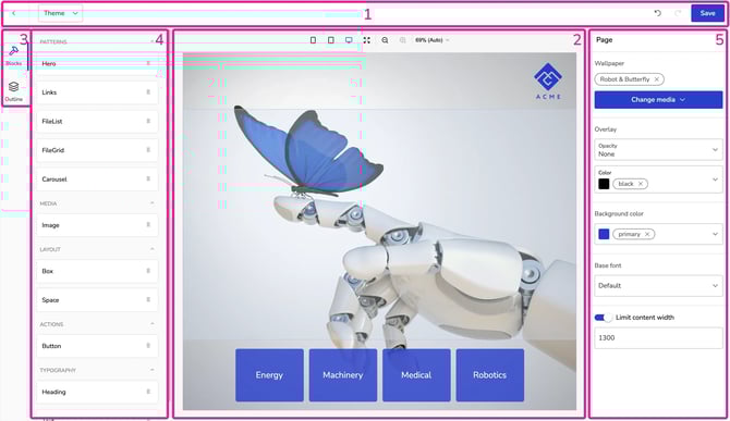
The interface is divided into five main areas. The numbering below matches the screenshot above.
1. Top menu

The Top menu controls your editing session.
Here you can:
-
Navigate back to the folder.
Note: This does not save your changes. -
Change or remove the template at any time from the Template-button*.
-
⚠️ Switching templates resets the visual structure and styling. A warning will appear before the change is applied.
- To remove a template: After clicking the Template button, click "Remove template from this folder" on the bottom left in the template window.
- *The Template-button is not available when you are creating your own template.
-
-
Use the arrows in the top-right corner to undo or redo recent changes.
-
Click Save once you are finished editing. Changes are only applied after saving.
2. Page canvas
The Page canvas is your working area. This is where you build and structure your Layout in real time. Everything you place on the canvas represents how the page (your Home page or folder) will look to users once saved.
Here you can:
-
Drag blocks (4) onto the page
-
Rearrange sections
-
Click any block to edit its settings (5)
-
See changes instantly
- Use the device preview options to zoom in/out and check your layout in mobile, tablet, and desktop sizes
- Layouts are responsive by default, meaning components automatically adjust to desktop, tablet, and mobile views. You do not need to create separate versions.
3. Navigation panel: Blocks and Outline
On the left side of the screen, you can switch between two tabs:
Blocks
This is where you choose the blocks (4) you want to add to the page.
Outline
The Outline shows the current structure of your Layout. It displays:
-
Which blocks are placed directly on the Page
-
Which blocks are inside a Box
-
The hierarchy and order of elements
You can expand and collapse Boxes to see what they contain. This is especially useful when working with nested blocks.
The Outline helps you understand how your Layout is structured and makes it easier to select and manage specific elements in more complex designs.
4. Blocks
These are the building blocks of your Layout, and each one has its own purpose and behavior.
-
Select a block from the Blocks panel and place it on the Page canvas (2) with drag & drop
-
Each block has its own configurable options. One you select a block, its options will appear in the Properties panel (5)
- 💡 In addition to these blocks, the Page itself has configurable settings that apply to the entire Layout.
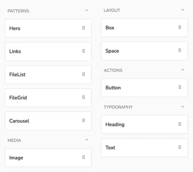
Available blocks:
- Patterns:
-
Hero: A prominent top section designed to create visual impact. Typically used for large headers, background images, branding, and introductory content.
-
Links: Manual navigation blocks that link to folders or files inside Showell. Ideal for curated sections and structured navigation areas.
-
FileList: Displays a dynamic list of files based on rules such as Recently viewed, Recently added, or Recommended. Content updates automatically.
- FileGrid: Displays the content of a selected folder.
- Carousel: Allows you to display multiple images or hero blocks that auto-scroll in your chosen time interval.
-
- Media:
-
Image: Displays a selected image. Used for logos, banners, or decorative visuals.
-
- Layout:
-
Box: A layout container used to group and structure other blocks. Controls alignment, spacing, and arrangement of its contents.
-
Space: Adds controlled empty space between elements to improve visual balance.
-
- Actions:
-
Button: Creates a clickable action element that links to content or sections inside Showell.
-
- Typography:
-
Heading: Title element used for section headers.
-
Text: Paragraph element used for descriptions or supporting content.
-
5. Properties
The properties panel options depend on which Block (4) you select.
-
Relevant property options only appear when relevant to the selected block. Not every block supports every option.
- Variants:
- Variants are available for Hero, Links, FileList, Button, Heading and Text blocks
- Variants allow you to quickly pick a preset for the selected block
- You may reveal all property options for the block by choosing 'Custom' from the 'variant' drop down
- When creating your own custom variant, you can save this to your variant list for later use
Available property options, listed alphabetically:
-
Align (horizontal): Aligns items horizontally inside a block (Left, Center, Right).
-
Align items: Controls how items are aligned across the cross-axis inside a layout block (start, center, end).
-
Background color: Sets the background color of a Page or block.
-
Background hover color: Sets the background color of an interactive element (e.g., Button) when hovered.
-
Background image: Adds an image as a background to a block (e.g., Box).
-
Base font: Sets the default font for the Page; other text elements inherit it unless overridden.
-
Border color: Sets the border color of a block or element.
-
Border radius: Controls how rounded a block or element’s corners are.
-
Color: Sets a color value for a setting (shown in Overlay).
-
Container background: Sets the background color behind a grouped container (e.g., Links container).
-
Container padding (horizontal): Adds inner spacing left/right inside a grouped container.
-
Container padding (vertical): Adds inner spacing top/bottom inside a grouped container.
-
Content: Defines the visible text content for Heading/Text (and similar text fields).
-
Data source: Selects the source for FileList content (e.g., Recently viewed, Recently added, Recommended).
-
Direction: Sets the layout direction (e.g., auto/column/row, or Vertical/Horizontal/Both depending on block).
-
File: Selects the file used in a block or element (e.g., Image, Hero media, Button).
-
File limit: Sets how many files a FileList shows.
-
File type: Shows or hides file type labels (Visible / Hidden).
-
Fill items: Makes items inside a block expand to fill available space.
-
Fill width: Makes an element (e.g., Image) expand to the full available width.
-
Font: Selects which font is used for text.
-
Font color: Sets the text color.
-
Font size: Sets the text size (numeric).
-
Gap: Sets spacing between items inside a block.
-
Grow: Allows a block or element to expand and fill available space.
-
Height: Sets the height of a block or element (numeric).
-
Horizontal padding: Adds inner spacing left/right inside a text element.
-
Hover color: Sets the hover color used by elements that support hover styling (e.g., FileList).
-
Image resize mode: Controls how an image scales within its block (shown in Hero).
-
Item background: Sets the background color for individual items (e.g., Link items).
-
Item gap: Sets spacing between individual items (e.g., links).
-
Item padding: Adds inner spacing inside individual items (e.g., FileList items).
-
Justify content: Controls distribution of items along the main axis (start, center, end).
- Limit content width: Limits how wide the page content can stretch. This prevents layouts from becoming too wide on large screens.
-
Margin (horizontal): Adds outer spacing left/right around a block or element.
-
Margin (vertical): Adds outer spacing top/bottom around a block or element.
-
Max width: Limits how wide a block or element can grow.
-
Opacity: Sets the transparency level of an overlay (shown in Overlay).
-
Padding (horizontal): Adds inner spacing left/right inside a block or element.
-
Padding (vertical): Adds inner spacing top/bottom inside a block or element.
-
Position: Chooses whether media is shown on the left or right side, or used as a background (shown under Hero).
-
Resize mode: Controls how a background image (or image element) scales within its block (e.g., cover).
-
Size: Sets a predefined size variant (shown for Button, e.g., Large) or a numeric space value (shown for Space).
-
Text align: Aligns text content (Left, Center, Right).
-
Text color: Sets the text color (used in multiple blocks, e.g., Links/FileList).
-
Text horizontal align: Aligns text horizontally inside an item (Left, Center, Right).
-
Text hover color: Sets the text color on hover for interactive elements.
-
Text padding: Adds inner spacing around text inside items (e.g., links).
-
Text vertical align: Aligns text vertically inside an item (Top, Center, Bottom).
-
Thumbnail: Enables or disables thumbnails (e.g., in Links).
-
Thumbnail layout: Sets how thumbnails are displayed (e.g., Background or Card).
-
Thumbnail size: Sets the size of thumbnails (e.g., Small).
-
Title: Defines the title text for an element that uses a Title field (shown in Button).
-
Translations: Opens multilingual editing for text fields.
-
Underline: Enables or disables underline styling for text/items.
-
Vertical padding: Adds inner spacing top/bottom inside a text element.
-
Wallpaper: Sets the Page background media (image or video).
-
Width: Sets the width of a block or element (numeric).
-
Wrap: Controls whether items wrap onto multiple lines when space is limited.
💡 FAQ
Is it possible to use a company font?
Absolutely! You have the flexibility to upload and utilize your own fonts. To accomplish this, you must upload your fonts to the Application Resources. Click here for more guidance.
Can I use Layout Builder together with Kiosk-mode?
Yes. Layout Builder and Kiosk-mode work very well together, especially for events, trade shows, showrooms, and other self-service content experiences.
For example, you can create a dedicated event folder with subfolders for product information, brochures, videos, presentations, or other relevant materials. With Layout Builder, you can turn that folder into a branded, page-like experience with clearly placed buttons that guide visitors to the right content.
When you then start Kiosk-mode from that folder, visitors can freely browse the tailored experience while staying within the selected content. This makes it easy to create a controlled, interactive, and professional event setup.
Is a Layout Builder background the same as a folder background?
No. A background image added inside Layout Builder, for example to a Hero, Box, or Page section, only affects that layout or page section. To set the general background/wallpaper that is inherited by folders and subfolders, use the folder background settings.
🔔 Troubleshooting
How do I move from the Legacy Template Editor to the new Layout Builder?
To avoid disruption, first create and apply your new Layout. Only remove the legacy template once the new Layout is fully set up and verified.
Follow these steps:
-
(Optional but recommended) Create your new Layout template first
-
Apply a new Layout to your folder or Main Page
-
Open the legacy Template Editor: In the same folder, you will see a blue information box indicating that a legacy template is still applied.
/Themed_folder_admin.webp?width=200&height=99&name=Themed_folder_admin.webp)
-
Click "Edit in Showell Admin" -> This opens the legacy admin interface.
-
-
Remove the legacy template:
-
In the legacy admin view, click "Switch to classic view" (under the template)
-
Locate the file named "Template" > Select it > click "Delete".
-
Once deleted, the legacy template is removed and the folder will use the new Layout you already applied.
Why is my background not displayed as intended?
The display size and aspect ratio of your and your users' devices can have a significant impact on how the background is displayed.
When choosing a background image for your Themes, it is recommended to use PNG or JPG file types. The long side of the background image should have a minimum of 2048 pixels.
It's important to keep the subject of the image centered because the background image sides might get cropped depending on the device being used. For example:
- iPads have a 4:3 ratio with dimensions of 2048 x 1536 pixels
- Laptops and monitors have varying aspect ratios depending on the Showell window size chosen by the user
- Phones can have ratios between 16:9 and 20:9 with dimensions of 2048 x 1152/922 pixels.
/Aspect%20Ratio.png?width=600&height=210&name=Aspect%20Ratio.png)